A Halloween-themed website can captivate visitors and draw in customers searching for a festive, spooky experience with their party rentals. A rental business can be a go-to source for all holiday event needs by creating a website design that exudes the Halloween spirit. Themed web designs attract attention and keep visitors engaged, making it easier to convert them into customers.

Planning Your Halloween-Themed Website
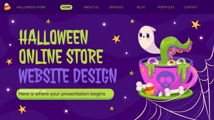
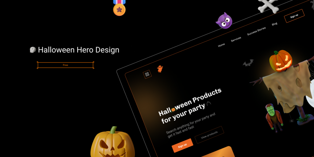
Start by creating a wireframe and prototype to outline your Halloween theme. This visual framework helps you arrange key elements, from navigation menus to graphic placements while sticking to a spooky and cohesive design. Establish a dark, eerie aesthetic by incorporating themed elements like cobweb borders, pumpkin icons, and ghostly graphics.
Halloween colors like orange, black, and purple instantly evoke a holiday feel, but balance is key for readability. Use dark tones with pops of vibrant orange or eerie greens. Select fonts that give a haunted vibe, such as script or serif with sharp edges, but avoid compromising readability. Adding contrasting backgrounds to text can improve legibility, especially on mobile devices.
Implementing Key Design Elements
For a seamless user experience, use a clear navigation structure, like a top menu or sidebar, and incorporate breadcrumb navigation so users can easily backtrack if they explore deeper into your content. Make the design responsive to ensure it looks good on all devices.
Use a responsive grid layout to align sections consistently across desktops, tablets, and mobile devices.

Custom Halloween graphics such as bat icons, spider web dividers, and jack-o-lanterns can make the site immersive. Add interactive elements like hover effects that change colors or reveal hidden content to engage users. Parallax scrolling, where background images move slower than foreground content, creates a 3D effect that adds depth and excitement to the site.
Technical Aspects of Web Design
Implement HTML, CSS, and JavaScript to build a visually appealing and functional website. HTML provides the content structure, CSS styles the layout, and JavaScript allows for dynamic effects like animated elements or pop-ups.

Optimize for mobile with responsive design techniques and compress images to ensure the site loads quickly, avoiding long wait times that can lead to high bounce rates.
A secure website is essential, especially when handling customer data. Install an SSL certificate to encrypt user data and build trust. For party rentals, adding e-commerce functionality enables users to browse and book rentals directly. Ensure the checkout process is simple, with multiple payment options, to avoid cart abandonment.
Engaging Content and Features
A Halloween-themed landing page can set the stage, welcoming users with spooky greetings and visuals. Use banners and pop-ups to showcase special Halloween promotions, such as discounts on rentals or featured Halloween decor packages. With engaging content, customers will likely stay on the site and explore your offerings.
Incorporate Halloween music or sound effects to set the mood. A subtle, eerie soundtrack or background noises like cackling or howling winds can make the experience memorable. Videos featuring your products in Halloween settings can help users visualize their events. Add links to social media so users can share content and see Halloween inspiration on your profiles.

SEO and Analytics
SEO techniques can increase your Halloween website’s visibility. Incorporate Halloween-related keywords into titles, descriptions, and content, such as “Halloween party rentals” or “spooky event decor.” Optimize images with alt text and reduce file sizes for faster loading, contributing to higher search rankings.
Analytics tools like Google Analytics monitor visitor behavior, track popular pages, and see where users drop off. Review metrics to decide which elements to improve, such as optimizing popular pages or refining underperforming ones. This data-driven approach ensures your website stays effective.
Accessibility and Final Touches
Design with accessibility in mind so all users, including those with disabilities, can enjoy the Halloween experience. Provide alternative text for images, closed video captions, and keyboard navigation. Test the site for screen reader compatibility to ensure a smooth experience for everyone.
For an extra touch, create a unique 404 page with a Halloween twist, like a ghost-themed error message that fits your theme. These small details add to the overall user experience and ensure your website’s aesthetic remains consistent.
Frequently Asked Questions
How do I choose Halloween colors without overwhelming the design?
Use dark backgrounds with pops of Halloween colors, like orange or purple, to add vibrancy. Balance with contrasting text colors for readability.
Are there any tools to help create Halloween-themed graphics?
Yes! Tools like Canva, Adobe Spark, and Photoshop offer Halloween templates and elements. They’re great for creating custom graphics that fit your website’s theme.
How can I ensure my website remains user-friendly with Halloween elements?
A: Keep navigation simple and use spooky elements sparingly to avoid clutter. Test your website’s usability on different devices to ensure it’s intuitive and responsive.

