
In today’s digital age, where more people than ever are accessing the internet using their mobile devices, having a mobile-friendly website is no longer a luxury but a necessity. As users increasingly rely on smartphones and tablets for browsing, businesses and developers must prioritize responsive design to ensure their websites offer an optimal experience across all devices.
This article introduces you to the fundamentals of responsive design and guides you through building websites that adapt seamlessly to any screen size.
What is Responsive Design?
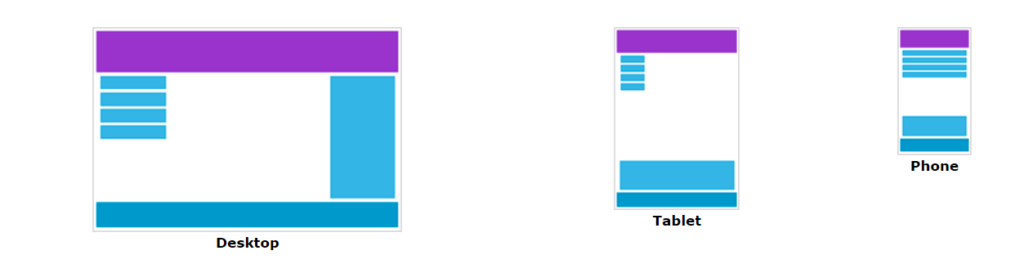
Responsive Web Design (RWD) is an approach to web design that ensures websites automatically adapt their layout and content to fit the screen size and orientation of the device being used. This means that whether a user is viewing a website on a desktop computer, a laptop, a tablet, or a smartphone, the content will be displayed in a way that is optimized for that specific device.
In the modern digital landscape, responsive design is essential for delivering a consistent and positive User Experience (UX) across different devices. With users accessing websites from various devices, it’s crucial to maintain a uniform experience regardless of the screen size.
Responsive design ensures that navigation is intuitive, content is accessible, and visuals are clear, no matter how or where the website is accessed. This improves user satisfaction, boosts engagement, reduces bounce rates, and enhances a website’s overall effectiveness.
Core Principles of Responsive Design
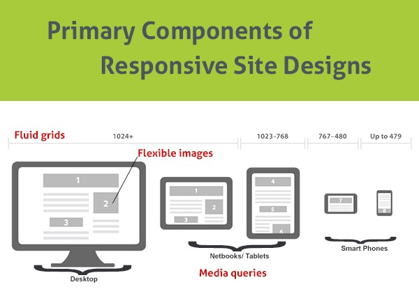
Fluid Grid Layouts
Fluid grid layouts are a fundamental component of responsive design. They allow web elements to resize proportionally rather than relying on fixed pixel-based dimensions. By using relative units like percentages instead of absolute units, a fluid grid enables a website to adapt its layout smoothly across different screen sizes.
To implement fluid grid systems using CSS, developers can define the width of columns in percentages and adjust the layout using CSS properties like max-width, min-width, and float. This approach creates a more responsive and fluid design, where elements naturally scale about the screen size.
Flexible Images
Flexible images automatically resize to fit the width of their container, preventing them from becoming too large or small on different devices. This helps maintain visual integrity and avoid layout issues on various screen sizes. It also improves page load times, as smaller images can be downloaded more quickly.
Media Queries
Media queries are a powerful tool in CSS that allows developers to apply different styles based on the characteristics of the user’s device, such as screen size, orientation, and resolution. They enable websites to adapt their layout, typography, and other design elements according to specific conditions, ensuring a tailored user experience across all devices.
Tools and Frameworks for Responsive Design
CSS Frameworks
CSS frameworks like Bootstrap and Foundation are essential tools for building responsive websites efficiently. These frameworks come with pre-built components and styles, making it easier to implement a responsive design without starting from scratch.
Bootstrap, one of the most popular frameworks, offers a comprehensive set of CSS classes and JavaScript components that streamline creating responsive layouts. Foundation, another widely-used framework, is known for its flexibility and robust grid system, allowing developers to create responsive websites with minimal effort.
They provide a consistent development base, ensuring the design is responsive and compatible across browsers and devices. Additionally, frameworks like Bootstrap and Foundation include pre-defined responsive grid systems, UI components, and utilities, significantly speeding up development time and reducing the need for custom code.
Grid Systems
Most CSS frameworks include built-in grid systems based on a 12-column grid. This means the page is divided into 12 equal columns, and content can be placed within these columns using CSS classes. While the default grid system provided by a framework is often a good starting point, you may need to customize it to meet your specific design requirements.
This can involve:
- Changing the number of columns: You can adjust the number of columns in the grid to suit your layout needs.
- Modifying column widths: You can change the width of individual columns to create different layouts.
- Creating custom grid classes: You can create custom CSS classes to define specific grid layouts for certain parts of your website.
Implementing Responsive Design

Viewport Meta Tag
The viewport meta tag plays a critical role in responsive design by controlling how a website is displayed on different devices, particularly on mobile devices. Web pages may not scale correctly without this tag, resulting in a poor user experience. The viewport meta tag tells the browser how to adjust the page’s dimensions and scaling to fit the screen of the device being used.
Breakpoints Management
Breakpoints are the screen widths at which a website’s layout needs to change to provide an optimal viewing experience on different devices. They are essential in responsive design, allowing developers to apply different styles based on the screen size. Common breakpoints correspond to the widths of common device types, such as smartphones, tablets, and desktops.
For example, a typical set of breakpoints might include:
- Small devices (smartphones): 576px and below
- Medium devices (tablets): 768px and below
- Large devices (desktops): 992px and below
- Extra-large devices (large desktops): 1200px and above
Instead of rigidly defining breakpoints based on specific devices, consider the content and design’s needs. First, design for the smallest screen size, then gradually add breakpoints to enhance the layout on larger screens.
Responsive Navigation Menus
Creating responsive navigation menus ensures users can easily navigate your website on any device. Traditional horizontal navigation menus can become challenging to use on smaller screens, so it’s important to employ techniques that make navigation mobile-friendly.
One popular method is the “hamburger menu,” where the main navigation links are hidden behind a menu icon (often three horizontal lines) on smaller screens. The menu expands to show the navigation links when the user taps the icon. This approach keeps the design clean and uncluttered on mobile devices while providing access to all menu options.
Advanced Techniques
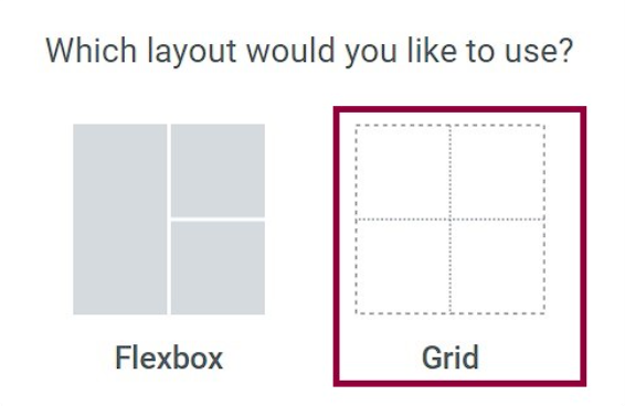
Flexbox and Grid Layout are powerful CSS tools that provide flexible and efficient ways to arrange and distribute content on a web page. They are handy for creating complex, responsive layouts.
Flexbox:
- One-dimensional layout: Flexbox is designed to lay items in a single row or column.
- Flexible container: The container element can be configured to grow, shrink, or wrap its content.
- Item alignment: Flexbox allows you to control the alignment of items within the container.
Use Flexbox to align cards horizontally and vertically and Grid Layout to create a grid of cards. You can also use it to arrange elements like a logo, navigation menu, and search bar. Flexbox can also distribute content across the footer and Grid Layout to create a more complex footer structure.
Grid Layout:
- Two-dimensional layout: Grid Layout is designed to lay out items in a grid structure.
- Row and column tracks: You can define rows and columns in a grid and place items within them.
- Grid areas: Grid Layout allows you to define named areas within the grid and place items in those areas.
Scalable typography is also vital in responsive design. It ensures that text remains readable and aesthetically pleasing across different devices. Without responsive typography, text could appear too large or too small on various screen sizes, leading to a poor user experience.
Testing and Optimization
Ensuring your website works seamlessly across different browsers is crucial in providing a consistent user experience. With a wide range of browsers available, each with its rendering engine and support for various web standards, cross-browser compatibility is essential in responsive design.
To achieve cross-browser compatibility, you can use several tools and techniques to test your website across different browsers and devices:
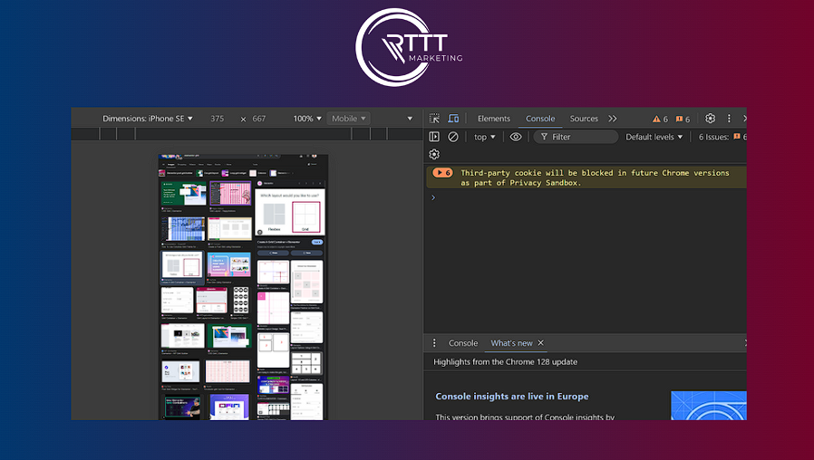
- Browser Developer Tools: Most modern browsers, such as Chrome, Firefox, and Edge, offer built-in developer tools that allow you to inspect and test your website’s performance on different screen sizes and orientations.
- Online Testing Tools: Services like BrowserStack, CrossBrowserTesting, and LambdaTest enable you to test your website on a wide range of browsers and devices without owning each one. These tools provide real-time testing environments and allow you to identify and fix compatibility issues efficiently.
- Polyfills and Shims: If your website relies on modern CSS or JavaScript features that are not supported by all browsers, you can use polyfills or shims to ensure compatibility. These scripts provide fallbacks for unsupported features, ensuring your website functions correctly across all browsers.
Optimizing your website’s performance, especially for mobile devices, is essential for delivering a fast and smooth user experience. Mobile users often have slower internet connections and less powerful devices, making performance optimization a critical aspect of responsive design.
A well-optimized website enhances user experience, improves search engine rankings, and reduces bounce rates. Mobile users expect fast-loading pages and even a slight delay can lead to frustration and potential traffic loss.
Accessibility Considerations
Accessibility in web design, often abbreviated as “a11y” (with the “11” representing the 11 letters between “a” and “y”), is about ensuring that your website is usable by everyone, including individuals with disabilities. In responsive design, accessibility is especially crucial because it ensures that your mobile-friendly websites are inclusive, allowing all users to navigate and interact with your content, regardless of their abilities or devices.
Responsive design should focus on visual adaptability and making your site navigable and functional for users with disabilities, including those who rely on screen readers, keyboard navigation, or other assistive technologies.
Key accessibility considerations in responsive design include ensuring that content is easily perceivable, operable, understandable, and robust across all devices and screen sizes.
Frequently Asked Questions
What is responsive design?
Responsive design is a web design approach that ensures websites automatically adapt their layout and content to fit the screen size and orientation of the device.
What are the core principles of responsive design?
The core principles include fluid grid layouts, flexible images, and CSS media queries to create a design that adjusts and scales based on the screen size and device orientation.
What tools and frameworks are available for responsive design?
Popular CSS frameworks like Bootstrap and Foundation provide pre-built grid systems and components that make it easier to create responsive websites. They offer a structured approach to building layouts that adapt to different devices.